Food52 Homepage

Food52 Homepage
Food52 is a brand uniquely positioned to offer its users a true blend of quality editorial content with a curated, welcoming shopping experience. While the business has scaled and grown rapidly in popularity over the past few years, the homepage had not been touched in almost a decade. It hindered a user’s understanding of what Food52 is and the true personality behind the company. The best homepages serve as the face of a brand—an instant understanding of what a company has to offer and the nuances to their offerings. We wanted our homepage to convey all of our warmth, personality, and unique style while also functioning as a true interactive experience that helped users discover the internal pages of the site. Role: Art & UX Direction / Design.
Product Goals
As part of my process, it is always essential to clearly define goals with key stakeholders and product managers so we are aware of what we are designing towards. It’s important for goals to be articulated as both concepts and metrics; a clear vision laddering up to concrete measures of success. As a product, our goals for the new homepage were:
— Improve brand awareness and perception: Create a modern experience that showcases the full scope of what we have to offer to new users, advertisers and investors.
— Enhance the visual design and user experience: Craft a fully responsive, mobile-optimized site that is both highly functional and beautiful (more on design-specific goals in sections below).
— Increase revenue: Increase commerce revenue by improving the visibility of our Shop, and increase ad revenue by providing better discoverability of our content (including video, editorial franchises, and promotional modules).
— Highlight community: Underscore the importance of our community to the brand, something that has been a deep part of our history, by improving social follows and exposing the different layers of our community throughout the site.
We measured the success of our goals by looking at KPIs related to: commerce revenue, conversion rate, bounce rate, page speed, retention rate, and social follows. Secondary KPIs looked at were ad revenue and referrals from the homepage.

Research & Competitive Audit
Every major design project starts with a comprehensive audit of our competitors and a general design inspiration sweep. In many ways, Food52 has twice the competitive landscape to deal with because we are competing with both traditional media/editorial companies (like NYT, Epicurious, Food Network) as well as traditional commerce brands (like Williams-Sonoma, Crate & Barrel, and Restoration Hardware).
Within this research, we further categorized specific modules and elements we wanted to focus on: standard editorial modules like newsfeeds, reverse-chron feeds, recipe and article modules, as well as shopping-specific modules like browsing by categories, featured products, and promotional banners. We were also interested in highlighting some special “brand” moments on the page, featuring video, social, and an area to convey messaging around our mission statement. Last but not least, we paid special attention to on-page navigation systems and how they work for both content and shopping experiences.


Stakeholder Meetings & Wireframes
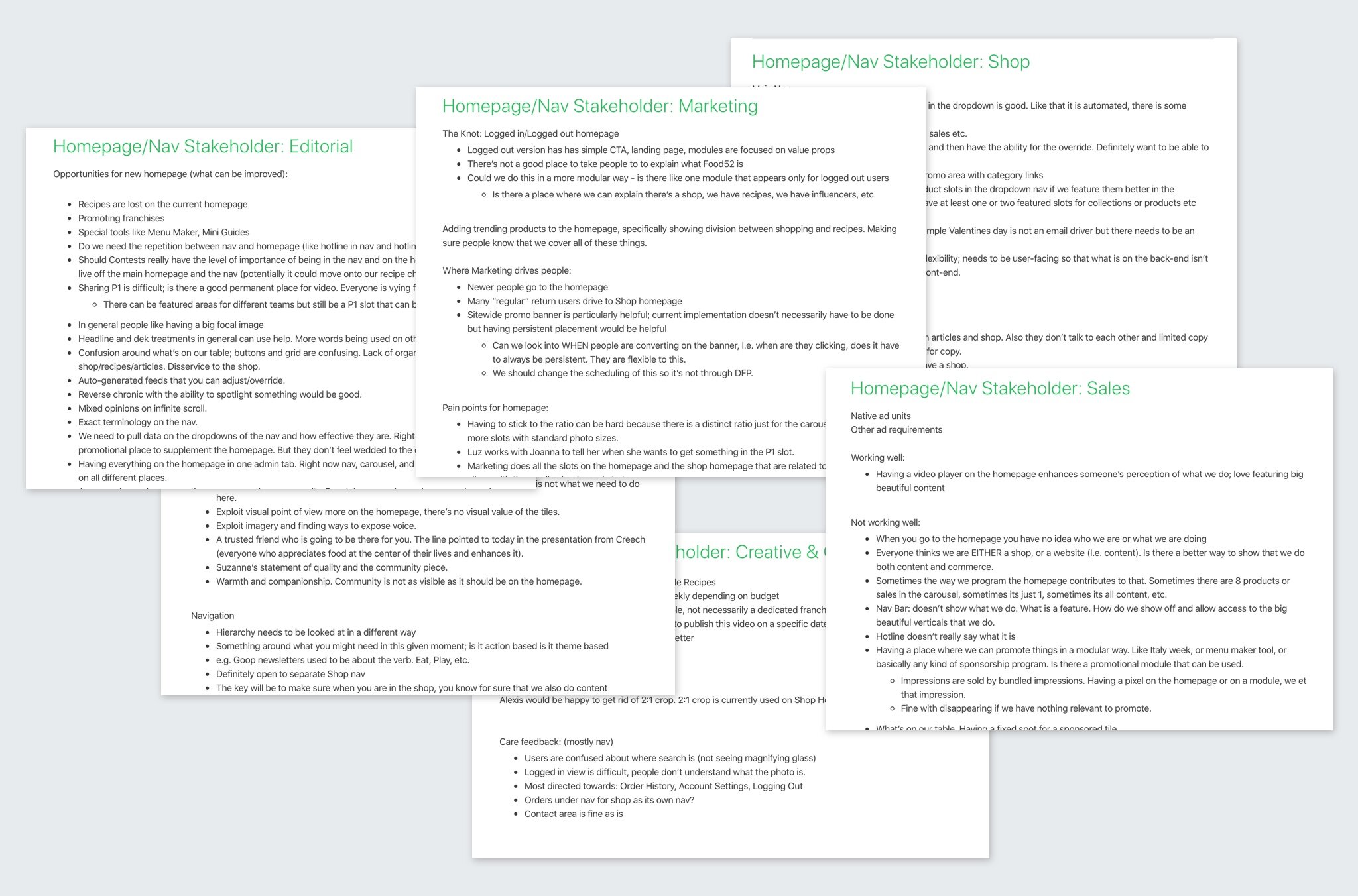
In tandem with our research phase, I worked closely with the senior product manager and Chief Product Officer on stakeholder conversations with every internal team at the company. This was a big moment for the brand and each team came with their own specific goals and interests that the new homepage would serve. Similarly, we also discussed specific pain points and difficulties with the old homepage. Armed with this information, we headed into the sketch and wireframe stage.
As one of the larger projects for the brand, I thought this was an important moment for everyone on the design team to have a voice in the initial stages of this project. I lead the team through several workshops where we discussed business and stakeholder goals with higher level design concepts, then sketched individually, and then came back together again to work through more concrete layouts and module ideas. Overseeing this collaborative process, it was a good developmental opportunity for the designers on the team while also providing the business with a stronger overall design on the strength of this collaboration.

Old Homepage Design & New Design Goals
In looking at the old homepage, I identified additional concrete, design-specific goals that addressed some of the pain points of the old design and also laddered up to help achieve our larger product goals. Design-specific goals included:
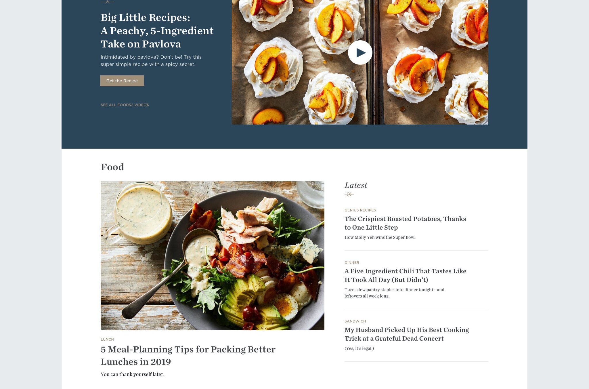
— Typography and photography working together in harmony: On the old page, type and photo were competing at every turn, with dark overlays obscuring the beautiful, original photography. Headlines and tags were indecipherable through unreadable and dated type design. We wanted the new design to significantly improve the typography throughout the page to optimize readability and elevate the overall visuals, while also highlighting all the striking photos throughout the site.
— Improve overall experience and functionality: As a user, the old page was very difficult to navigate. Every module looked the same even though they all linked to different types of content. Users had no idea if they were going to be taken to a product or an article or a recipe until after they clicked. With limited real estate and no clear sections, internal teams were forced to compete for space and the business had to constantly make trade-offs for what they wanted to highlight. From an advertiser/investor perspective, it was hard to tell a brand story of all the different spheres we covered. As an experience, we wanted to weave together the different aspects of our offerings while still being very clear about the distinct types of things we offer. This applied to both content types (recipes, articles, products) as well as overall themes (food, travel, home). The page should be as functional as it is beautiful.
— Tell a unique story of content with commerce: Food52 is one of the only brands to truly successfully have the quality of offering to blend content and commerce together, yet the old homepage made it incredibly difficult to expose these stories when we had them. We’d have a beautiful piece featuring the story of a maker, with accompanying products to purchase, but there was no place on the homepage to highlight this blend that was so unique to Food52. A major goal of this redesign was to showcase this unique offering much more successfully and seamlessly.

Final Designs & Results
Our final designs elevate the scale of Food52’s visuals so that everything feels big, striking, and immersive. We also took care to highlight our Shop throughout the page, to help further drive revenue and awareness to the store without being overtly salesy. There are specific sections to convey themes we cover (Food, Living, Travel), as well as very clear distinctions between articles, recipes, and products. We also took care to weave the more interactive/transactional offerings (recipes and products) within areas that are more narratively driven and tell a story (articles and videos). Lastly, we incorporated dynamic areas throughout the page that could change modules depending on the stories that could unfold throughout the year with various default states and overrides that can be controlled by the Editorial, Shop, and Marketing teams.
The resulting page has had measurable impact on the business, observed through some initial A/B testing. Some key metrics include: 9.6% increase in conversion rate, 21.8% increase in recipe page views, and 4.6% increase in ads viewed per user.


