Food52 Global & Shop Navigation

Food52 Global & Shop Navigation
Food52 has an incredible universe of offerings for users. It is essential to have a navigation system that supports this universe, that can help guide users through the website and lead them to discover areas they’re not aware of. This project was a complete overhaul of Food52’s old global navigation system, as well as the secondary navigation system used throughout the shop. Role: UX & Art Direction
Product Goals
One of the biggest navigation challenges Food52 faces is how to successfully convey the top-level content channels for the brand on a global level, while also offering a highly functional and interactive commerce-driven navigation that is crucial in a shopping experience. At a practical level, our product goals were to:
— Improve retention and brand perception: by creating a modern browsing experience to better guide our users.
— Increase commerce revenue: by highlighting main categories in the nav on mobile and better organizing to help streamline shopping.

Old Navigation & Design-Specific Goals
There were a number of pain points in the old design. Overall it was visually very cluttered, with lots of notifications and messy design systems competing. The shop dropdowns prioritized promotional slots instead of helping users get to categories and efficient browsing. Mobile was particuarly problematic—because of the deep layering of dropdowns, sub-categories were completely hidden on mobile. So a user might be aware we have Kitchen, but would have no idea that we have Pots & Pans, let alone how to get to that page. In identifying these problem areas, I created some design-specific goals for the project that would ladder up to our overall product goals and help achieve our KPIs. Design goals included:
— Improve the UX design and overall functionality: to help seamlessly guide users throughout the different parts of our site.
— Significantly optimize navigation for mobile: particularly on the commerce side, to ensure we are providing the best shopping experience possible.
— Utilize the nav as a brand awareness tool: that will help educate users, investors, and advertisers on the full scope of our offerings.
— Refine visual designs: to enhance readability and modernize the overall look and feel.

Initial Designs & User Testing
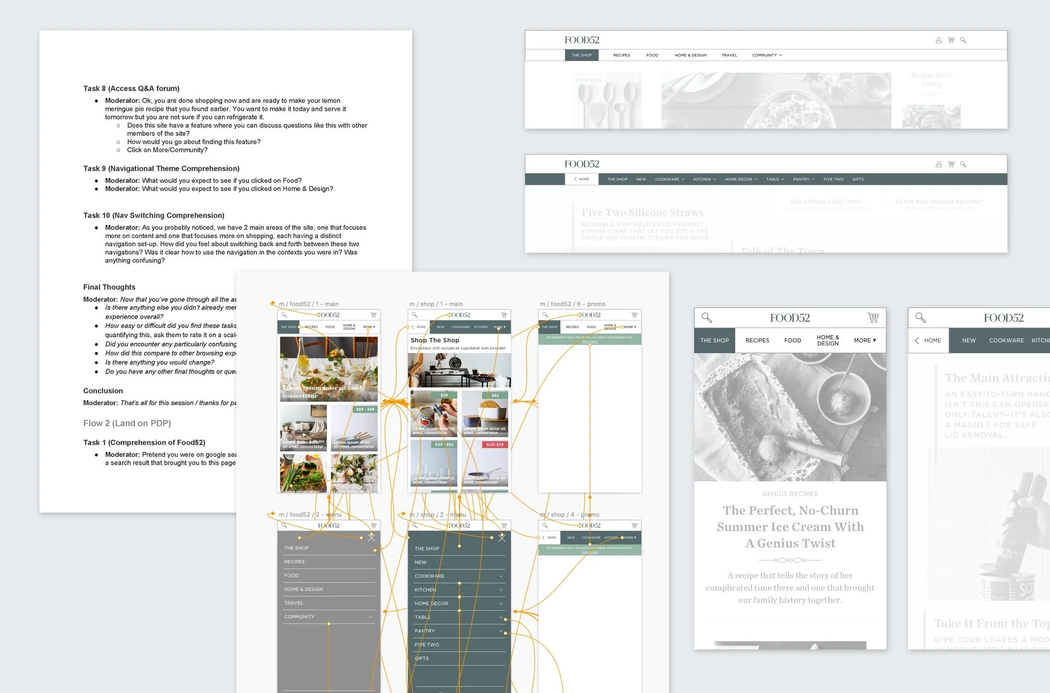
For this project, I directed our UX designer and visual designer on the overall designs. Our initial UX proposal explored an unconventional solution: the navigation was meant to switch back and forth between a content view and a shop view, rather than sit as a sandwich with a main nav (content) and a sub-nav on the shop side (commerce). This solution allowed the commerce nav to truly become the main nav when a user was in shopping mode, rather than always being relegated to a sub-nav. It elevated and highlighted categories and sub-categories when users were shopping. However, because we were using an unconventional nav pattern, it was important to conduct thorough user-testing.
Under my direction, our UX designer created an interactive, clickable prototype from the wireframes she had designed. In conjunction with the product manager, we drafted a script that targeted some of the key issues we wanted feedback on. We conducted in-person testing with volunteers, covering both desktop and mobile views. The result was that users struggled to understand the concept. The switching nav proved to be too difficult and not intuitive. So we went back towards a more traditional system.


Final Designs & Results
In response to the feedback during user-testing, we returned to a more traditional main nav + sub-nav approach. My UX designer worked through a scroll system in which the shop nav would take over as the main nav on scroll, so we’d get the benefit of the effect we wanted to push the commerce nav forward when shopping, while still maintaining a more traditional nav/sub-nav pattern that was familiar to users. Dropdowns still held promotional spots, but were balanced visually to drive the users to categories and sub-categories. There was special attention paid to mobile to ensure sub-category pages were easily accessible, with additional ways to browse by popular brands.
To validate the new designs, we went through another round of rigorous in-person user-testing. This time, users were able to easily navigate and explore the site with the new UX pattern. It was a valuable experience to be able to innovate freely, test, adjust, test again, and feel confident about the product we launched.
Following launch, we’ve begun A/B testing additional iterations. One of the initial proposals set forth by the product managers was to try a mobile design that removed the dreaded hamburger icon on mobile. However, we discovered that this icon has over time become so familiar to users that it now acts as a notifier of additional nav choices. With additional A/B testing and continuous iteration we’ve adjusted one more time by exchanging the “More” dropdown for the traditional “Menu” with hamburger icon selection.